When a group of community musicians, archivists and cultural workers sat around a scarred kitchen table in east London two years ago, we didn’t set out to change council funding. We wanted to make visible what our ears already knew: that diasporic music scenes—Afrobeat nights, South Asian experimental collectives, Caribbean sound system cultures—were thriving in fragmented pockets across the city, but remained invisible to the people who decide where money goes.
Why a map, and why now?
Mapping has always felt like a political act. Who gets named on a map, who doesn’t, determines what is seen as legitimate. For marginalised music scenes, the problem isn’t just lack of resources; it’s erasure. Grants and cultural strategies often prioritise institutions with tidy metrics and long track records—museums, established venues, conservatoires—rather than the messy, intergenerational networks that host pop-up raves, youth-led workshops and hybrid residency models.
I was part of a small team that believed a different form of evidence could make that case: not only statistics but stories, geographies and relationships. The idea was simple—create an interactive, collaboratively-sourced map that documented where diasporic music activities happened, who ran them, the histories behind them and the audiences they served. But the execution required a different set of skills: community trust, web design, ethnography, and a refusal to let institutional gatekeepers dictate the narrative.
How we built it
We partnered with a community arts charity, a local university’s ethnomusicology department, and a volunteer collective of DJs, promoters and archivists. The backbone was a lightweight web platform—an instance of the open-source mapping tool Mapbox—customised to allow audio clips, oral histories and event photos to be attached to map points.
Our process was intentionally lateral and iterative. We ran listening sessions in community centres, church basements and barber shops. We went to sound systems in Peckham, tabla circles in Wembley and experimental electronica collectives in Tower Hamlets. At each site we recorded brief interviews—five to ten minutes—where hosts explained what their nights meant to them and what challenges they faced.
We also trained local volunteers to gather data, write short micro-histories and tag events by function (education, performance, community support) and scale (hyperlocal, borough-wide, regional). The decision to decentralise data collection was crucial: people documented scenes they lived in and cared for, which produced richer, nuanced entries than any external audit could.
What the map showed—and why it mattered
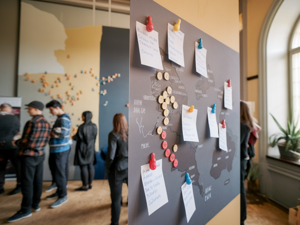
At first glance, the map looked like a constellation of pins. Zoom in and you saw patterns. Certain wards with high cultural diversity had almost no formal venues listed but were dense with DIY practice spaces. Youth clubs, mosques and market stalls doubled as rehearsal rooms and pop-up venues. Sound systems passed along through family networks hosted educational programmes for teenagers. These were not incidental; they were cultural infrastructure.
We layered the map with funding data scraped from public council records and Arts Council England reports. That juxtaposition produced a stark visual contrast: areas with the richest mosaic of diasporic music practice were not the ones receiving the most targeted support. The mismatch was undeniable.
Using the map to influence decision-makers
Once the map had a critical mass of entries—several hundred points and dozens of audio testimonials—we started inviting local council officers and funders to bespoke walkthroughs. Instead of delivering a polished presentation, we invited them to join a community-led listening session. They sat on folding chairs while a young promoter from Brixton spoke about losing rehearsal space because of rising rents; an elder steelpan player talked about mentoring kids who had no arts provision in school; a collective explained how a tiny grant would allow them to host a series of intergenerational workshops.
The visceral effect of hearing those voices mapped to real streets is hard to overstate. For many bureaucrats it was their first time hearing directly from practitioners outside established institutions. The map acted as a translator: turning anecdote into evidence, and evidence into a spatial logic that could be used for strategic planning.
Concrete shifts in funding decisions
Within a year of our first walkthrough, the council published a revised cultural strategy. Three elements in particular bore our fingerprints:
- Micro-grants for DIY Spaces: A new micro-grant stream aimed at community-run rehearsal spaces and pop-up venues, with simplified application processes co-designed with the very collectives the grants were meant to support.
- Place-based Investment: Funding allocations began to factor in cultural density—derived from our map layers—rather than relying solely on venue-based metrics.
- Capacity-building Programmes: Targeted support for music producers and promoters from diasporic backgrounds, including mentorship, business training and access to affordable rehearsal spaces.
It’s worth noting these changes were not caused by the map alone. They were the product of sustained advocacy, strategic alliances with sympathetic council officers, and a media campaign that amplified the map’s findings (several local outlets and the Guardian ran pieces referencing our work). But the map acted as the hinge: it made an abstract argument concrete, and it gave funders a tool they could plausibly use in their decision-making.
Challenges and tensions
Mapping intimate cultural practices raises ethical questions. Who owns the stories? Could mapping lead to gentrification if planners used the map to market ‘authenticity’? We tried to mitigate these risks by embedding consent processes, anonymising sensitive entries and including a community governance panel to decide what to publish.
Another tension was between readability and complexity. Funders wanted neat categories and dashboards; community contributors wanted narrativity and nuance. We balanced this by maintaining separate views: a simplified dashboard for strategic briefs and a richer, exploratory view for public engagement.
What I learned—practically and politically
First, evidence that moves people is often multimodal: numbers + narratives + geography. Second, building trust takes time. The most valuable contributions came from people who initially declined to participate until they felt our project was truly community-owned. Third, small interventions can shift policy when they fit into existing bureaucratic logics—our map didn’t overthrow structures, it plugged into the way councils already make spatial decisions.
| Stakeholder | Role | Benefit observed |
|---|---|---|
| Community promoters | Data contributors, storytellers | Visibility, access to micro-grants |
| Council officers | Decision-makers | Spatially-informed funding allocations |
| Funders (local & national) | Resource allocators | Evidence for place-based programming |
At Sacredskulls Co we care about hidden histories and the infrastructures that sustain cultural life. This project reminded me that mapping is more than cartography: it’s a way of re-distributing attention. For anyone thinking of doing similar work, start by listening, devolve power, and be ruthless about matching the format of your evidence to the decisions you want to influence.